You see this photo? The sky is a lovely color. but the waves are so dark...what if I lightened the photo so that the waves are exposed properly...?
Ta da! But look at the poor sky. Washed out. :( So much for that.
But then I remembered something. Lightroom has this awesome tool called "adjustment brush".
You can set exposure, clarity, sharpness, saturation, etc, and then "paint" it on the photo wherever you want it.
So:
I took the adjustment brush and lowered the exposure just a tad.
Then I painted over the top quarter of the photo, where the sky is.
See? It is darker. The photo is way more balanced, and it has an HDRish look to it!
Isn't that awesome!?
Naturally, I went crazy with it, and had a ball editing these next photos. :D
Those stars made my day :)
Okay, now you go try! It isn't hard. If you don't have Lightroom, don't despair. Look around a bit, and you might find other options. I've heard good things about GIMP, a free photo editing program.
I've been interested in HDR (High Dynamic Range imaging) Photography for a while.
There are some great HDR images out there, and the technique is very unique.
Here are a few professional HDR images (all link to a post):
by Gavin Phillips
by Leonardo Riano
by Nicholas Moeggenberg
by James Brandon
by MorBCN
After browsing around and reading some tutorials, I decided to give it a try.
I needed 4 things:
A camera
A tripod
A program that did HDR photo merges (Corel PaintShop Photo Pro X3)
Something to photograph
Well, I ended up just photographing my neighborhood. HDR is a more dynamic kind of photography. It shows closer to what the human eye sees, and captures more of the range of colors and light.
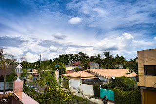
In this first photo, the sky is a lovely blue, and the clouds are fluffy and white. But the rest of the neighborhood is a bit underexposed, and the light is kind of "murky" there.
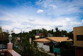
But....voila! In this photo, both the sky and the neighborhood are properly exposed! Cool, right!?
But, you say, HOW in the WORLD did you do that?
It is actually quite simple.
I set my camera up on the tripod.
I turned the Aperture Priority mode on.
I correctly exposed for the sky.
Then I shot about 7 different exposures.
In some of the photos, the sky is way over exposed, but the neighborhood is lovely.
In others, the neighborhood is way underexposed, but the sky looks great.
Then I took those photos and imported them into Corel PSP, a program that is somewhat like Adobe Photoshop.
I clicked on "HDR Photo Merge" and loaded about 7 photos.
I fiddled with a few settings, and got this photo. Amazing.
(Basically all the program does is merge the images together.)
Here is another HDR photo merge that I have done (in color and black and white):
HDR is used mainly for landscape and cityscape photography. There are great things about HDR, and not so great things. If you look at the clouds in the comparison photos above, the clouds are much clearer in the original photo than in the HDR. That's because clouds move. I took 7 images and merged them together, but the clouds moved slightly in each shot, so they are blurry in the final product.
In my photo, it looks a little weird and unprofessional, but some photographers are very talented at using the moving clouds to their advantage, like in the last example I gave. (by MorBCN)
So, HDR photography is amazing. I enjoyed experimenting with it, and look forward to using it occasionally.
It is definitely not a technique that should be used all the time, but there are a few instances where it can be very well used. Why don't you give it a try?!
I've been enjoying editing these photos the past day or two. They had a really "golden" look to them, and I had fun playing with some overexposure... Let me know what you think. :)
It was a bit hard for me to find a photo for this...I didn't have one that was obviously framed, but I came up with these two that will work.
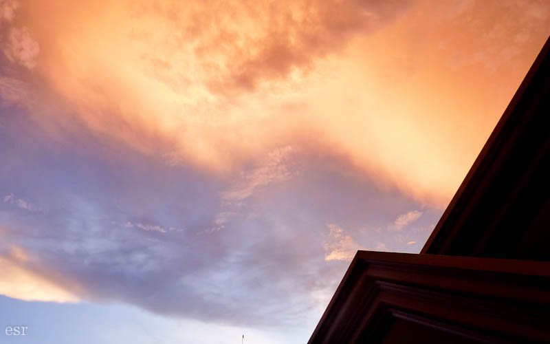
Here I am framing the sky at sunset with the roofs near me...
....and here I am framing a clump of flowers through the a hole in the railing of our deck.
It's fun when you find a subject that would work well with a frame... the problem is finding a frame!
Tomorrow's element of composition is Lines.... mysterious....;)
Happy November, by the way!
An image histogram is a type of histogram that acts as a graphical representation of the tonal distribution in a digital image. It plots the number of pixels for each tonal value. By looking at the histogram for a specific image a viewer will be able to judge the entire tonal distribution at a glance.
Blah, blah, blah. ;)
In English, an image histogram is a graph that shows you all the different shades in an image from pure white to all black. So histograms differ depending on the photo.
(p.s.: Usually you can find a setting in your camera's menu that says "histogram." Just turn that setting on to see a histogram when shooting! Refer to your manual if you need help...)
Okay, now you know what a histogram is.
But how does it work?
Take a look at this photo:
(yep, same one I posted yesterday :) )
See that there is quite a range of tones in this photo, from the almost white sun, to the dark shadows in the bottom half of the photo.
In a histogram the edges are the most important part.
Okay. The left side of this histogram represents the darker places in the photo. And the right side represents the light spots.
Keeping that in mind, look at the far left side of the histogram. See that grey strip running up the side? That represents the dark places in the photo, which are also the blue shaded places in the below photo.
There the histogram is showing you those places are completely black. You can't "retrieve" them, or lighten them up, even in a good editing program because the camera just captured pure black.
This is what would happen if you tried to lighten those places up:
If you look closely, you can see areas that are just plain black. They aren't retrievable...you can't lighten them to see more detail.
And same with the white parts of the photo:
The white parts of the photo are shaded red... it's just the sun in this photo. But I can't darken the photo to be able to see the round shape of the sun, or see more shadows.
It can't darken the part that is completely white, because the camera didn't capture any detail there but plain white!
On the right side of the histogram you can see a little grey going up the side of the histogram. That represents the white part, the sun in the above photo.
Now, in the sunrise photo, (the good one, the first photo I posted) it was okay for me to have "irretrievable" places that were completely light or completely dark. I liked the photo that way... I didn't need to lighten or darken those places.
But in a photo like this...
Poor flower :(
it's NOT good!
You don't want a lovely orange flower overexposed to the point of being white. You won't be able to fix it, even in a fancy editing program.
When I try to darken it this is what happens:
Poor, poor flower :'(
Now, not all photos are as drastic as this. There may be a time when you are taking photos, and they look fine on your camera, but then you look at them on the computer, and you realize that there were places that were way too dark or too light. That is when the histogram comes in handy. You can read it and see quickly if places are too dark or light
(for the 1st flower photo)
As I quoted before, the edges are the most important part. If you have strips (aka pixels) running up the left side, you know some places are irretrievably dark, and if you have pixels running up right side, you know some places are irretrievably light.
So watch your histograms, friends!
:)
*if you read this whole thing without getting confused, brownie points to you!