You see this photo? The sky is a lovely color. but the waves are so dark...what if I lightened the photo so that the waves are exposed properly...?
Ta da! But look at the poor sky. Washed out. :( So much for that.
But then I remembered something. Lightroom has this awesome tool called "adjustment brush".
You can set exposure, clarity, sharpness, saturation, etc, and then "paint" it on the photo wherever you want it.
So:
I took the adjustment brush and lowered the exposure just a tad.
Then I painted over the top quarter of the photo, where the sky is.
See? It is darker. The photo is way more balanced, and it has an HDRish look to it!
Isn't that awesome!?
Naturally, I went crazy with it, and had a ball editing these next photos. :D
Those stars made my day :)
Okay, now you go try! It isn't hard. If you don't have Lightroom, don't despair. Look around a bit, and you might find other options. I've heard good things about GIMP, a free photo editing program.
Having a hard time deciding what kind of camera to buy? I wrote this article a few months ago for my photography class, and decided to post it here.
There are four main types of cameras: Digital SLRs, Superzooms/Bridge Cameras, Point and Shoots, and Camera phones. They all have their pros and cons, and I’ll be comparing them here.
When you are considering buying a camera, cost is a huge factor. Can you afford a professional camera, or is your budget more suited to a point and shoot? Obviously, the nicer camera you get, the more expensive it will be. It all depends on how much you are willing to spend, and also what deals you can find! Sensor size is important to look at when you are buying a camera too. The larger the sensor size, the more pixels a camera takes in per photo. That results in (for the most part) a nicer photo, especially in extreme light conditions. But camera with a larger sensor size will be more expensive. There is always give and take!
Let’s also talk about audience…what cameras appeal to certain groups of people. What professional photographer is going to go buy a camera phone to take fancy portraits or landscape shots? Pretty much no one I know of. Professionals are out to buy professional cameras. And vice versa; if someone wants a camera to take a few casual photos on their vacation, are they going to go out and buy a professional SLR that costs a load of money? Probably not. Someone like that would be more likely to buy a point and shoot, or even a phone with a camera. Bridge Cameras (aka Superzooms) appeal to the amateur photography enthusiast who doesn’t want to invest in an SLR and a few lenses. So if you are a professional photographer, you will probably have a much nicer camera than someone who is an amateur. Also, professionals sell their work. They take photos for people and make money. That helps pay for what they are spending on their cameras and equipment.
Next is convenience. Probably the most convenient phone out there is built into your cellphone. It is a given that your phone’s camera will not take pictures as well as a SLR. But you probably have your cell phone with you most of the time. You will be much more likely to capture moments that don’t wait for you to run and get your camera. Of course, the quality won’t be as good. Every camera has pros and cons.
This table is a comparison of the pros and cons of the four different kinds of cameras I've mentioned here: (click on the image to enlarge, or open the table in Skydrivehere!)
Click to enlarge
Hope this helps!
I know I had a hard time deciding on my first camera, and it would have been helpful to read something like this.
And my word of encouragement is: whatever camera you own, learn to use it. Often it is not camera that makes the picture good. I've had people ask me, "Does your camera take good photos?" and I have to say, "Only if you know how to use it!" Well, I guess if you put it on auto....but that's a different subject altogether. :)
Let me know what your thoughts on this are! I'd love to hear them.
| Disclaimer: This post is in no way affiliated with any company, and these are my opinions and my opinions only. Not to be mistaken for professional advice ;) |
1. If it can bend, bend it! 2. If there are two bendables, bend them differently.
Think about joints for this...shoulders, elbows, knees, even head/necks!
For instance, put on hand on the hip and have the other one just hanging
by your side. Legs are harder, but you could lean against a wall with
one leg out a bit, or shift your weight to one foot or the other.
Examples*
Not like this...
....like this!
*Disclaimer: these examples are not posed portraits. They were completely candid. Sorry :P
○○○
And because I can't wait any longer...
CHRISTMAS IS COMING!
I'll be posting photos of our great decorating tomorrow in honor of December 1st! :)
Here are a couple simple rules for portrait photography:
1. Don't shoot up the nose!
Sure isn't flattering ;) You may think: "It's a cool angle...why not take it?"
Portrait photography isn't about cool angles. It is about making your subject look good! It is important to portray them in a flattering way.
So find a different angle :)
2. Women turn heads toward the higher shoulder. Men toward the lower.
I'll use myself as an example:
The above pose looks more masculine than the one below. In the photo above, see how my head is tilted toward the lower shoulder? In the below photo, I'm tilting my head toward the higher shoulder. The second pose is much more flattering to a girl than the first.
I don't have an example of a male leaning both ways, but I think you get the idea!
I am posting an educational blog post, that (for once!) hopefully will not leave you feeling like your brain has been fried. :P It is just about using a reflector in indoor photography.
Ever seen those lovely photos that are highly grainy and orange tinted? Taken in low unnatural light inside a house? I have...lots of them.
I've even taken them. Like most people. :) But there are some ways to fix indoor-photography-that-isn't-so-great.
Use your flash. Try making yourself a diffuser. I posted a little about the one I made HERE.
Check your white balance. If you set it correctly, it can effectively reduce yellow-orangish lighting.
Get near those windows! Or a door! They usually provide the best indoor light.
Use a reflector. [This is what my post today is mainly about]
What? Reflector?
A reflector helps bounce light so that your subject is evenly lit.
Like so:
See how the left side of her face and her hair are all in shadow?
But after strategically placing a reflector beside her, her face is more evenly lit.
The below photo demonstrates the way I set the reflector up.
A window on her left and a reflector on her right! Voila.
Okay... what do you use for a reflector?
I use that shiny grey thing. I think it is called foam core, but I'm not sure... It works very well though!
When using a reflector, you often need an assistant to hold the reflector while you take the photo. Kind of inconvenient sometimes, but worth it in the end.
And the LAST element of composition I am posting about is:
Symmetry!
use mirrored or repetitive geometry to create balance
Today I have 4 photos to share with you...and I took them in the last 30 minutes! ;D
Windows
Closet doors
A wet leaf
Our gate :)
Well, I hope you learned something and got a few ideas from this series. I've been blogging about nine elements of composition for the past two weeks, and I am happy to be able start posting other things this week! :)
This is a group of balloons we spotted in the sky...they were tied to some kind of a sign. Mysterious!
I know that this isn't the nicest photo to look at, but I was proud of the fly for holding still for me.
This element is pretty easy to understand. You can use blank or empty space in your photo to bring attention to the subject. I think this element would work well with a shallow depth of field. Sorry I didn't have a photo to demonstrate that... :S
using horizontals, verticals or diagonals to emphasize your subject
Well, I don't have a perfect example to share with you today, but this photo will work with a bit of explaining.
I was photographing this bridge. (Yes, that is a bridge, and I walked over it!) See those lovely lines that the boards make? If I had moved my camera up a bit and focused on the PEOPLE instead of the BRIDGE, the lines would have emphasized the people beautifully. The photo is still nice, the composition isn't quite right to call it a lines example.
Only 2 days of this series left...hang in there! Tomorrow is Use of White Space :)
It was a bit hard for me to find a photo for this...I didn't have one that was obviously framed, but I came up with these two that will work.
Here I am framing the sky at sunset with the roofs near me...
....and here I am framing a clump of flowers through the a hole in the railing of our deck.
It's fun when you find a subject that would work well with a frame... the problem is finding a frame!
Tomorrow's element of composition is Lines.... mysterious....;)
Happy November, by the way!
place points of focus at thirds rather than center, center on the x- and y-axis
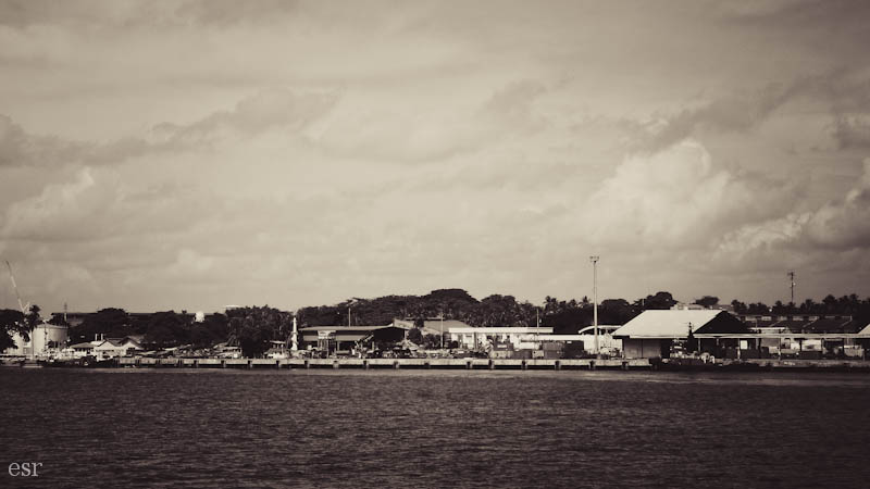
This photo demonstrates the Rule of Thirds element pretty well.
I placed the point of focus (the shoreline) two-thirds of the way down the photo, instead of smack in the center. It's not always the way to take a photo, but sometimes it gives a great effect!
P.S. I know the quality of the above photo is pretty bad...but I couldn't put a grid on it in my photo editing program so I had to do it in my graphic editing program. That made the photo awfully grainy. Apologies. *sniff*
My goal is to take (or hunt in my photo archive for) one or two photos that illustrate each of the nine elements :)
The first one is:
Filling Your Frame
The first photo is probably a better illustration of this element, but both work. I think the key is getting your frame filled with something, and have the majority, if not all of it in focus.
An image histogram is a type of histogram that acts as a graphical representation of the tonal distribution in a digital image. It plots the number of pixels for each tonal value. By looking at the histogram for a specific image a viewer will be able to judge the entire tonal distribution at a glance.
Blah, blah, blah. ;)
In English, an image histogram is a graph that shows you all the different shades in an image from pure white to all black. So histograms differ depending on the photo.
(p.s.: Usually you can find a setting in your camera's menu that says "histogram." Just turn that setting on to see a histogram when shooting! Refer to your manual if you need help...)
Okay, now you know what a histogram is.
But how does it work?
Take a look at this photo:
(yep, same one I posted yesterday :) )
See that there is quite a range of tones in this photo, from the almost white sun, to the dark shadows in the bottom half of the photo.
In a histogram the edges are the most important part.
Okay. The left side of this histogram represents the darker places in the photo. And the right side represents the light spots.
Keeping that in mind, look at the far left side of the histogram. See that grey strip running up the side? That represents the dark places in the photo, which are also the blue shaded places in the below photo.
There the histogram is showing you those places are completely black. You can't "retrieve" them, or lighten them up, even in a good editing program because the camera just captured pure black.
This is what would happen if you tried to lighten those places up:
If you look closely, you can see areas that are just plain black. They aren't retrievable...you can't lighten them to see more detail.
And same with the white parts of the photo:
The white parts of the photo are shaded red... it's just the sun in this photo. But I can't darken the photo to be able to see the round shape of the sun, or see more shadows.
It can't darken the part that is completely white, because the camera didn't capture any detail there but plain white!
On the right side of the histogram you can see a little grey going up the side of the histogram. That represents the white part, the sun in the above photo.
Now, in the sunrise photo, (the good one, the first photo I posted) it was okay for me to have "irretrievable" places that were completely light or completely dark. I liked the photo that way... I didn't need to lighten or darken those places.
But in a photo like this...
Poor flower :(
it's NOT good!
You don't want a lovely orange flower overexposed to the point of being white. You won't be able to fix it, even in a fancy editing program.
When I try to darken it this is what happens:
Poor, poor flower :'(
Now, not all photos are as drastic as this. There may be a time when you are taking photos, and they look fine on your camera, but then you look at them on the computer, and you realize that there were places that were way too dark or too light. That is when the histogram comes in handy. You can read it and see quickly if places are too dark or light
(for the 1st flower photo)
As I quoted before, the edges are the most important part. If you have strips (aka pixels) running up the left side, you know some places are irretrievably dark, and if you have pixels running up right side, you know some places are irretrievably light.
So watch your histograms, friends!
:)
*if you read this whole thing without getting confused, brownie points to you!